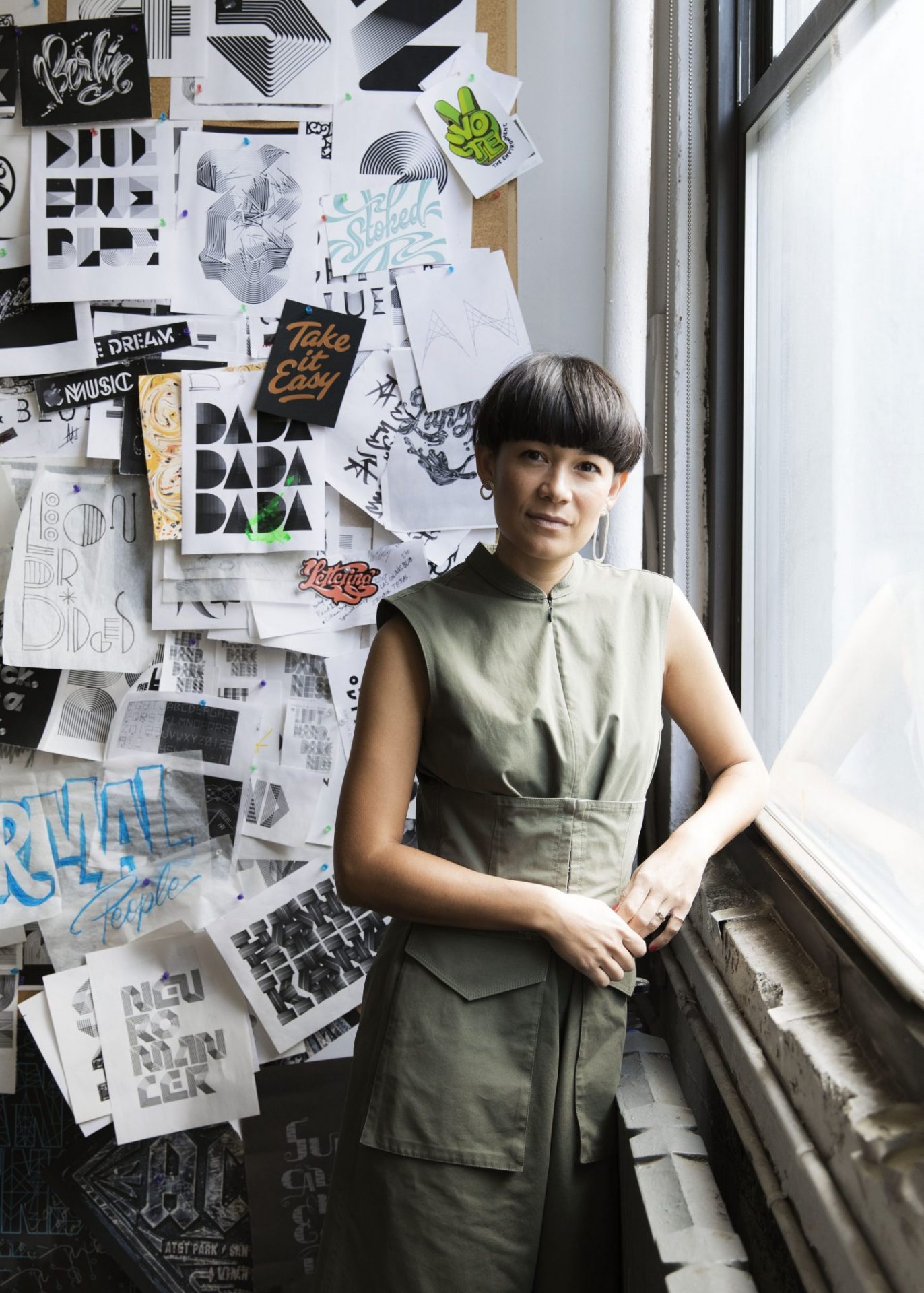
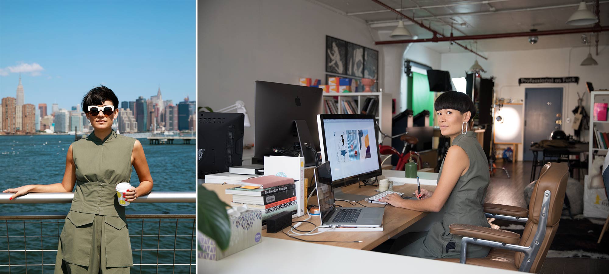
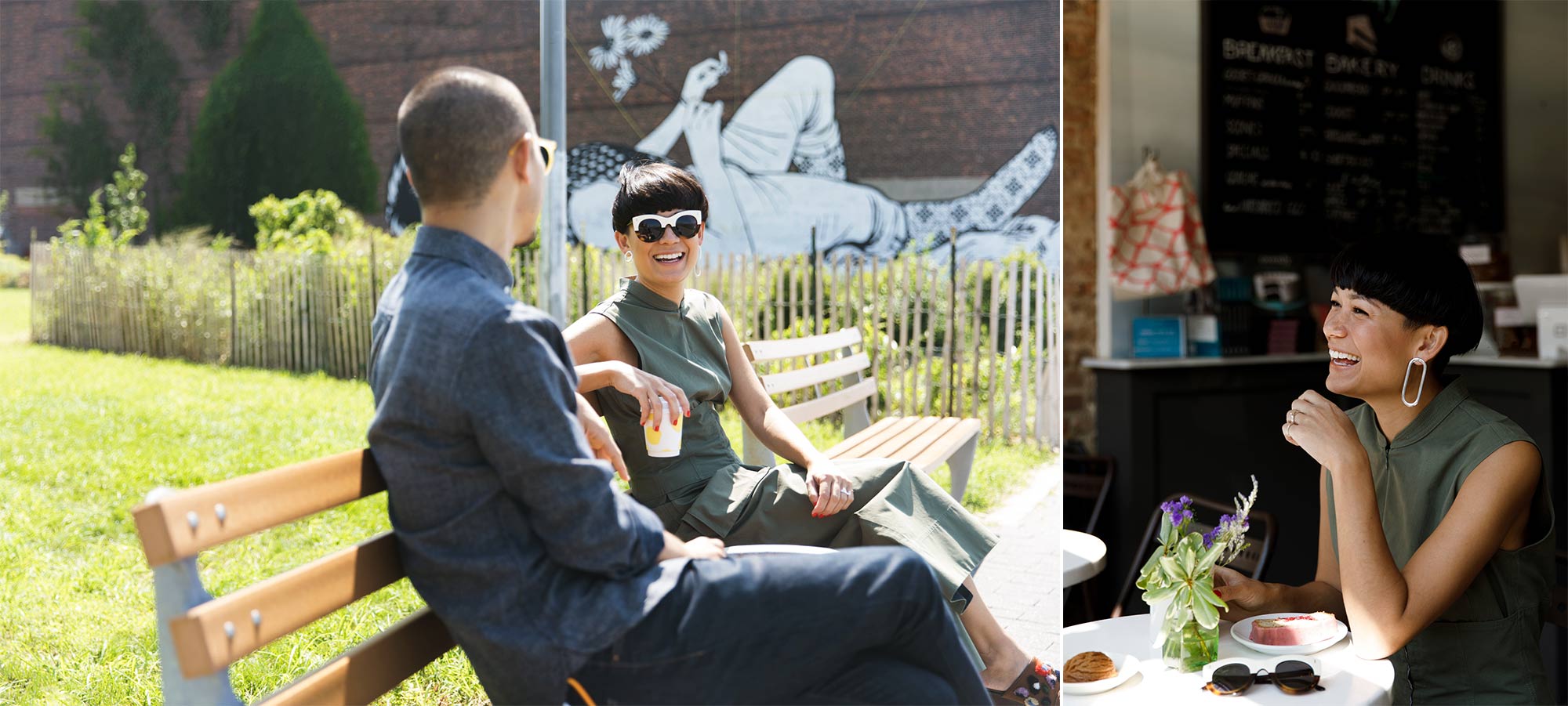
Simone Fabricius on Travel, Connection, and Branding

How one global citizen’s experiences have shaped her outlook on branding and design.
Danish-born designer Simone Fabricius has always loved drawing. From an early age, she recognized her passion for design, and after studying graphic design at the University of Copenhagen she moved to Paris to continue pursuing her career. After ten years of working for larger international branding and design agencies, Fabricius was ready to start something new.
Drawn by its pulsing energy, diversity, and abounding opportunity, Simone moved to New York looking for more boutique creative work. That’s when Spherical, luxury marketing agency, first had the opportunity to collaborate with her, working closely with the Palisociety team to build a new brand identity for the buzz worthy hotel collection. The partnership was awarded a prestigious W3 Silver Award by the Academy of Interactive and Visual Arts for website visual appeal.
On a recent sunny afternoon, we met up with Simone in Brooklyn’s Greenpoint neighborhood—where her studio is—to learn more about her path to becoming a creative director.

You’ve lived and traveled all across the world. How have your experiences impacted your creative process?
Traveling has been one of the most important aspects of my career. From the beginning, I’ve always wanted to connect with people through design, and being able to immerse yourself in a new culture allows you to connect with people in a very special way. I think the sensitivity I’ve developed through traveling has been a key to the way I work, how I look at products, and how I envision brands reaching their audience.
Hospitality is often the center point for cultural exploration. How do you see those brands evolving?
The modern traveler is looking for deeper connections and more meaningful experiences in hospitality; whether that’s in a restaurant, coffee shop, or hotel. They’re looking to feel comfortable and welcome. A lot of hotels in the past didn’t make you feel welcome because they felt quite cold. Now you see a lot of brands wanting to incorporate the local culture, to create gathering places for family and friends having a coffee or a meal—not just create space for someone who needs a bed. You’re seeing more multi-purpose spaces, and hotels are becoming more like a heart in that area, which I think is very nice.

When you take on a new branding project, what are the keys to developing your work?
I think the key thing for branding and design in general is having purpose. I can’t stand looking at design that is only there for aesthetic reasons or that’s just pretty, that feels brainless or thoughtless. That’s something I find very wasteful.
For every design element or every color or any typography I use, it has to have a real purpose, and a real sense of belonging to the brand. It’s about making intelligent choices. That’s the difference between what I do as a brand designer as opposed to what an artist does. I don’t have the freedom of an artist. I’m working to communicate to a very specific target, and it has to be efficient.
Very rarely do I design anything for myself. You need to go beyond your own emotions and your own preferences and forget your own personality for a second. It takes quite a bit of empathy, making intelligent choices and trying to understand who is buying the product is very important and very interesting.
What sort of design sensibilities are home base for you?
I think I really work well with a lot of color. I’m not afraid of it. I think people would find that I have a good balance with it. If I use a lot of color then everything else is quite minimal. If it’s minimal, then you add something else. I think good design is all about balance.
It’s like putting on makeup; if you have big bold red lips, then you should be subtle with the eyes.
Check out our work together on Palisociety’s brand development here.
689 words
Recent Spherical Articles

